On an afternoon ride home on a bus, suddenly the idea of catwoman VS joker came to my mind.
Went home, did lots of picture research on them and shifted my idea to 'girl power'. So I did another search on female super heroes. Other than Wonderwoman, I really didn't really think the rest were popular enough. However, I had a problem- how am I going to portray the idea of girl power with just 2 characters. I thought of having guys in the background but in the end, another idea hit me.
A module I was taking mentioned about the sex scandal of Bill Clinton and Monica Lewinsky. And the famous blue dress came into pictire. So I thought, the given colors that we were allowed to use were black white and ____. Perfect. Blue it shall be.
Also, I have decided to portray them such that people would think of iconic movie posters at one glance. Here are some references.

This sort of gave me an idea, but I have never heard of this movie before so I thought others may not know of it too. I needed something more iconic.
Juts a picture for reference.

Original sin.

Another idea.

And finally, I decided on this. Bill Clinton and Monica Lewinsky & the blue dress in Mr & Mrs Smith.
Til then, I shall start drawing...
- OK I have completed my assignment 2 and this is by far the MOST tedious one. I had to redo it 4 times in total whether the change is big or smal...-
So my very first draft went like this:

this is the photo that i used photoshop to create. Imposed Monica Lewinsky and Bill Clinton's faces onto the movie Mr and Mrs smith poster.
Below are hand drawn sketches


And so I proceeded to fill in the colors.


AND when I was about to print, I reread the assignment instructions and realised I have gone in the wrong direction. Abstraction process that ends up with a pictogram but I have done an abstraction piece. So, I redrew and modified the last 3 steps. It was difficult because it was not easy to make a pictogram of this initial photo, but I thought I should not change the whole thing. So here we go. With MORE drafts before settling on this one.


cleaned up the strokes from this step onwards for a more clean cut look.


pictogram.
But when I proceeded with printing, the color came out quite differently. It was more purplish than on the screen. The significance was the blue dress so I had to change the color manually to another shade of blue that guaranteed a close print out. And so this is the 3rd set.


Unsatisfied, but made do with this and brought it to tutorial.
My classmates laughed at me, ok I laughed at myself too. Sat on the chair of confession and realised I had done it wrongly. After clearing up much doubt and confusion, I could not bare to take another look at this work. So immeidately after the tutorial, I went back and redid it, for the 4th time...
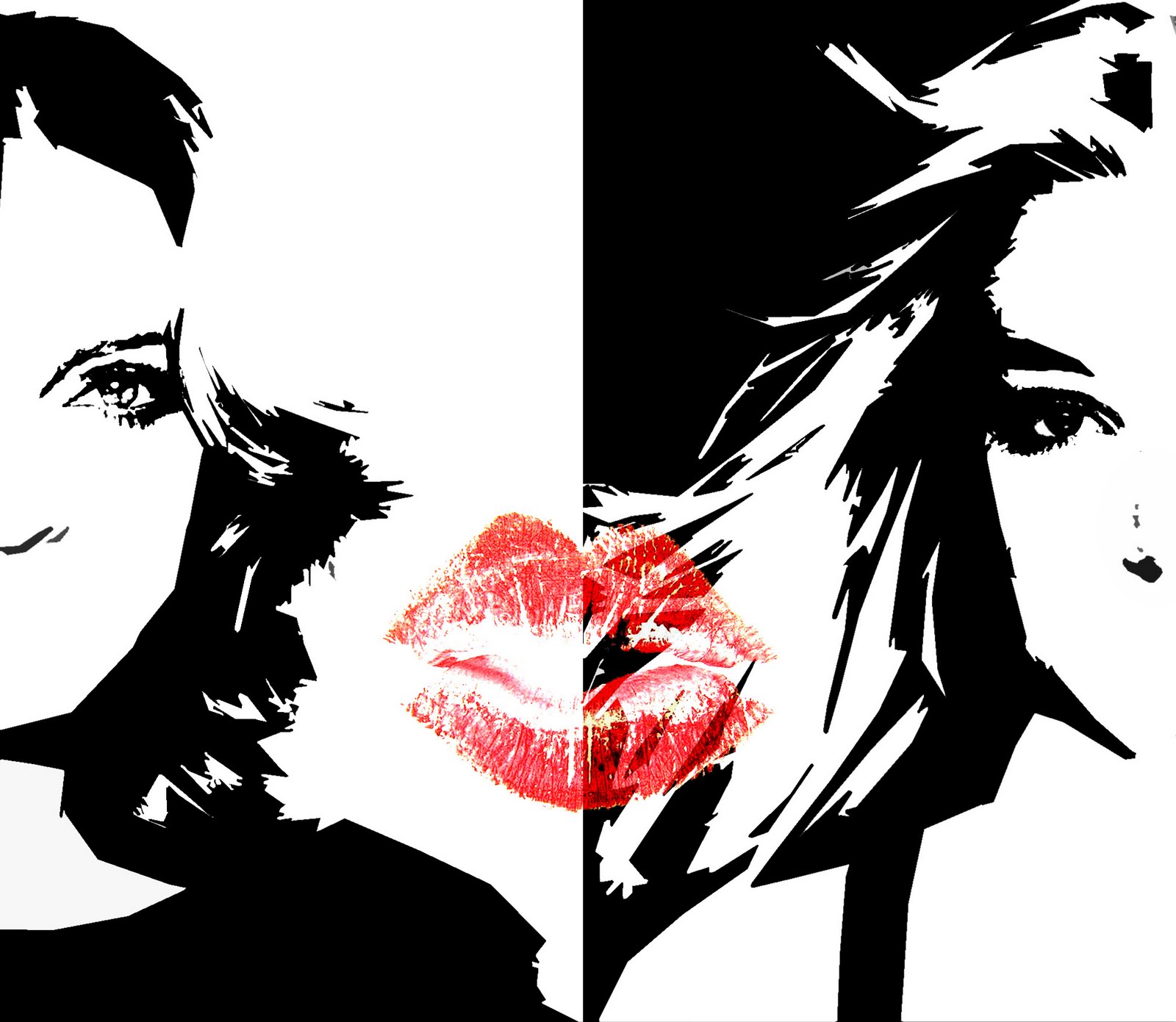
The idea came to me when I was sitting in tutorial and only had britney spears in mind. Actually I did thought of beyonce and lady gaga's collaboration - telephone. Also, Adam lambert was on the list, but in the end i settled with madonna and britney. They shared a famous kiss in the performance of the song - Me against the music. The reason why I chose to work on celebrities was because most of my classmates did on politicians.
So I was thinking and playing around on photoshop with regards to the orientation of the 2 faces and after many trials, I settled with this. And my final work. My final prototype would probably be step 3 or 4.

Madonna

Britney

Photo

1

2
3

4

5
Managing a weak smile after ALL THAT hassle and brain drain!
At least I'm satisfied with my work for now! :D
No comments:
Post a Comment